Colour is Back! How to Use Colour in Your Home in 2025
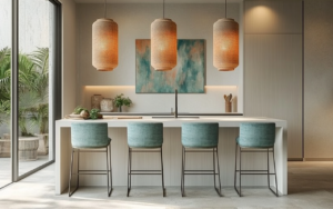
Affordable Luxury – Colour Trends for 2025 are all about embracing bold, vibrant hues and bringing a sense of personality and warmth back into our homes. This year, colour is making a strong comeback, and knowing how to use it effectively can completely transform your space. Whether you’re after a modern, sophisticated look or something playful and energetic, colour is your best friend. Ready to dive in? Let’s explore how to use these trends to create a home that feels fresh, stylish, and uniquely you.
How to Use Colour in Your Home in 2025
If you’ve been playing it safe with neutrals, 2025 is the year to step outside your comfort zone. Colour is back, and it’s bolder than ever. But using it effectively is key to creating a harmonious and stylish home, not a chaotic one. Here’s how to make the most of this year’s colour trends while keeping your home looking polished.
Pro Tip: Pay Attention to Natural Light
Before you start slapping paint on your walls, here’s an important insider secret: natural light matters. The direction your room faces can significantly impact how a colour looks throughout the day. For example:
- Northern-facing rooms tend to receive cooler, greyish light, making colours appear more muted. To warm up these spaces, opt for warmer hues like terracotta, mustard, or earthy greens.
- Southern-facing rooms, on the other hand, bask in warmer, yellow-toned light all day long, which can enhance cool tones like soft blues or cool greys, creating balance in the space.
Pro Tip: Use the 60/30/10 Rule
For a balanced, designer look, stick to the timeless 60/30/10 rule. This trick is used by interior designers everywhere to create harmonious spaces. Here’s how it works:
- 60% of the room should be your dominant colour, like your walls or larger furniture pieces.
- 30% is your secondary, complementary colour, which can be used in textiles, rugs, or accent chairs.
- 10% is your bold ‘pop’ of colour that adds personality. Think decorative cushions, artwork, or a standout piece of furniture.
This formula ensures that even if you’re working with bold colours, the room feels balanced and cohesive rather than overwhelming.
How to Test Your Colours
The Right WayOne of the biggest mistakes people make when testing colours? They paint samples directly on the wall! This can give you a distorted view of how the colour will look because the current wall colour can affect the sample.
Pro Tip:
Instead, paint your test colours on a white piece of paper and tack it to the wall, leaving a white border around it. Leave it there for at least 24 hours so you can see how the colour changes with different natural lighting. This simple step ensures you’re making the right choice for your space.
Sustainable Choices Matter
When embracing Colour Trends 2025, don’t forget about sustainability. Choosing eco-friendly, low VOC (volatile organic compounds) paint is a smart move for your health and the planet. These paints reduce harmful emissions and come in a range of gorgeous colours, making them perfect for a modern, eco-conscious home design. Brands like Farrow & Ball and Little Greene offer stunning, low VOC options that align beautifully with this year’s trend towards natural, earthy tones.
Affordable Interior Design for Your Dream Home
At Dreamcatcher Interiors, we believe that creating a stunning, colourful home shouldn’t break the bank. That’s why we focus on affordable interior design solutions that bring luxury to your space without the hefty price tag. Whether you’re looking to embrace the latest colour trends or want a complete room makeover, we’re here to help you create a space you love—on any budget.
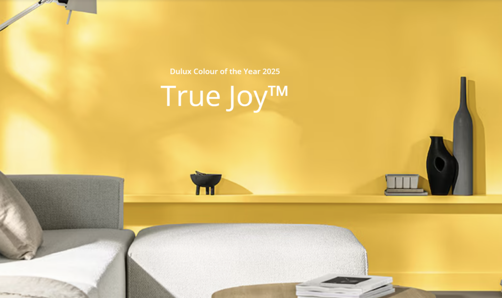
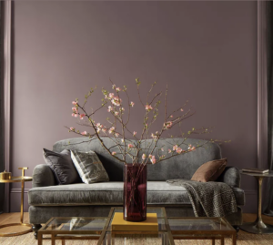
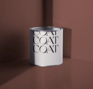
Here are our favourite Affordable Luxury – Colour Trends for 2025 but as we LOVE colour there will be more! (Dulux, True Joy – Benjamin Moore, Cinnamon Slate and Coat Paints, Petticoat Lane)

If you want to see How the team at Dreamcatcher Interiors Love to use colour why not check our on of our projects HERE